Thanks to some nifty Twittering, I've managed to get myself a Google Wave invitation! After getting the invitation on Friday, I now need to send out my invitations to test out how it works. I've sent a few to people I know but have sill got a few left. If anyone's interested in getting hold of a Google Wave invite just send me your email address.
If your wondering what Google Waves all about, here is a brilliant video on 'What is Google Wave?' created by Epipheo Studios - http://www.epipheostudios.com/
Riding the Google Wave! Surf's Up!
Labels: Epipheo Studios, Google Wave 0 commentsWebsite Review - Jeff Bridges.com
Labels: Hand Drawn, Jeff Bridges, Leo Laporte, Review, Web Trends 2010, Websites 0 commentsToday after watching a Leo Laporte program, live on http://live.twit.tv/, and following some of their links to Design Tutorials 4U - Top 10 Web Trends for 2010, one trend that was mentioned was the 'Sketches, hand drawn style and illustrations.' An interesting website that includes this trend is the Jeff Bridges' site.


 So after browsing through his many pages, which was hard because his navigation links to go back to the main menu only appeared at the very bottom of the page (took ages to scroll down!) I started to really enjoy the look and style of his little sketches/drawing. I also liked that there was hardly any computer text and was mainly done in his handwriting. This made everything really interesting and unique due to the use of different font styles he used while writing headings and paragraphs. Even his links had a unique element to them too...
 A truly unique style of web design which revolves around hand drawn elements. The navigation could do with some improvement but overall an interesting site to look at.
'Put this in your pipe and smoke it Microsoft!' - Google Chrome OS
Labels: Chrome OS, Google, Microsoft 0 commentsOK, maybe I miss heard the quote a little but Google revealed more details of its new Google Chrome Operating System yesterday showing off how everything will soon be running in your browser! A very interesting concept. The only problem I'm unsure about is its ability to save and store all your date. The new Chrome OS netbooks won't be using traditional hard disk drives - they will be relying on internet-based storage for saving all your data. This would mean you would need the internet for everything on a Chrome OS netbook!
Watch a brief demo video of how Google Chrome OS works -
And a concept video for Googles Chrome OS -
Seminar 5 - Design Exercise 5, Resizing, Fixed and Fluid
Labels: Dave Woods, Fixed Column, Fluid Column, Multimedia, Resizing, Web Design 0 comments'Using tutorials given in lecture or what you have learnt from CSS tutorials set, create a basic template (any design) showing a fixed and a fluid design. i.e. one using a fixed width (pixel) dimension and one using a ‘fluid’ % dimension in CSS
This can be as simple as a box…or you can show understood concept by applying to design already created.'
After looking through some 'Fixed' and 'Fluid' tutorials, I found that Dave Woods' explanation was the best, thanks Dave Woods!
- Fixed 2 Column
http://www.dave-woods.co.uk/index.php/creating-a-simple-css-layout/ - Fluid 2 Column
http://www.dave-woods.co.uk/index.php/2-column-liquid-css-layout/

My example of Fluid column design -

The Amazing Google Story
Labels: Google, Motion Typography, Youtube 0 comments'A (very) quick look back at the Google story over the last 11 years. From Stanford to Mountain View and around the world, featuring many different products, starting with BackRub (Search) up to Google Wave, StreetView and Chrome.'
Seminar 5 - Design Exercise 5, Research & Development Task
Labels: Colour Harmonies, Colour Wheel, HP, McDonald's 0 comments1.
Find a colour wheel online.
Investigate colour harmonies.
Which do you like?
Are you drawn to particular ones?
In looking for colour harmonies, I found this website really useful -

The colours I liked together were these colours -

This Analogous colour scheme uses colours that are next to each other on the colour wheel. 'They usually match well and create serene and comfortable designs.' I find this Analogous colour schemes reminds me of colours that you can find in nature which makes it pleasing to the eye.
2.
Change the colours of a brand/log.
How do you feel about the brand now?
What associations do they have before and after?

I've chosen the trusted HP brand. Their logo, originally coloured blue or black, now changed to red gives it a different feel. Looking at the red HP logo, I feel like its demanding attention but not in a good way. Red to me symbolises warning and urgency and can convey the feeling of having to make a quick decision and being rushed. On the other hand, the blue conveys the idea of modern and professional. It also feels more respected and that its a trust worthy brand.
3.
While travelling home think about why companies have chosen certain colours and how they make you feel about their identity. Do the colours match your image?
Lets take McDonald's logo...
- 'Yellow evokes cheerfulness. Houses with yellow trim or flower gardens sell faster.
- Reds and oranges encourage diners to eat quickly and leave. Red also makes food more appealing and influences people to eat more. (It is no coincidence that fast food restaurants almost always use these colors.)
- The most visible color is yellow.
- Hard colors (red, orange and yellow) are more visible and tend to make objects look larger and closer. They are easier to focus upon. They create excitement and cause people to over-estimate time.'
4.
Journal Exercise
Create two web pages in basic html/css that evoke the words ‘harmony’ and ‘disharmony’.

Inspirtational Typography from Abduzeedo
Labels: Abducted by Design, Inspiration, Typography 0 comments


YouTube Now in 3D!
Labels: 3D, City and Wool, Cross-eyed, Youtube 0 comments
Maybe it's the fact that I haven't spotted the little drop down menu on some of YouTube's 3D videos, but YouTube have recently been experimenting with all sorts of different methods of getting 3D, from the Red/Cyan Glasses: Full Colour to Cross-eyed! In spotting this only a few weeks ago, I designed a simple test of my own 3D Cross-eyed feature!
Information is Beautiful!
Labels: Infographics, Inspiration, The Visual Miscellaneum 0 commentsA book on infographics called 'The Visual Miscellaneum,' a source for inspiration for my web design project!
http://www.informationisbeautiful.net/2009/the-visual-miscellaneum/


The Power of Tumblr - Blogger Watch Out!
Labels: Nisa Aris, Tumblr 0 commentsI’ve just been looking through Nisa Aris’ work and noticed at the bottom of her website, she has a link to her Tumblr site! Since the start of my Multimedia course at Nottingham Trent University, I’ve always been using Google’s Blogger but now, after spotting Tumblr (and liking it a lot!) I think I’m going to convert to Tumblr soon.
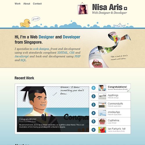
Looking through Nisa Aris’ sites I really like the way her designs (her portfolio and Tumblr page) compliment each other, which is done by keeping a constant theme through these sites. In light of this, I hope to re-design my website, blog and twitter page so that I can keep a uniformity in my style and a familiarity within my brand ‘City&Wool.’
Website Wireframe
Labels: Speakers Corner, Web Design, Websites, Wireframe 0 commentsHere is a quick wireframe for my Speakers Corner web design project - Main points for index page -
- Clean & simple design (Similar to http://purplerockscissors.com/)
- Good use of large photos/images (Within the events highlights)
- Simple to navigate (Navigation at top right)
- Use of Javascript elements within the site
- Key information displayed on right hand side (Opening times, telephone, email)
- Easy to contact/network with Speakers Corner (news/twitter feed)
- Band/DJ profiles (Links to their sites - good use of networking)
- Speakers Corner to be considered as a brand? tag line?
- Link their Twitter feed to the site to keep up to date with events
http://csszengarden.com/
Subscribe to:
Posts (Atom)
