Kitty&Wool's Upgrading... WordPress Time!

0 comments

After much deliberation, I have decided to change my blog over to the wonderfully powerful WordPress! This is mainly for two reasons -

  1. Blogger won't delete your blog (They even deleted their own blog once... http://bit.ly/6zURlr)
  2. WordPress is a CMS (Content Management System) and I want to experiment with how it can be integrated into my website - http://www.danielryland.co.uk
  3. It also displays some really good statistics on your blog, telling you how many views per day your getting.
OK, maybe that was 3 reasons but the first one was a bit of a joke.

So from now on, Kitty&Wool with be WordPress-ing instead of Blogger-ing and can be found here -

http://cityandwool.wordpress.com/

P.S. Notice Kitty&Wool has now become City&Wool... this, I hope, will become my professional brand.

I've Come to a Big Conclusion!

0 comments

I have successfully been able to research ways of how I might approach getting work experience or a work placement and conclude that networking is crucial to my success and very important. Through self-promotion and using social media sites to network, I see these as invaluable ways of getting my name and work known by other designers and design agencies.

In light of this, I will be improving my online portfolio by wiping off the cobwebs and updating it regularly with more current work and blog articles, signing up to more designers and agencies via Twitter feeds to get a wider understanding of their thoughts and works and I will also start signing up for newsletters and RSS feeds in order to increase my knowledge of certain works within the wider industry of interactive media.

I have also come to realise that creating a creative CV in an innovative way and sending it to different design agencies and companies would be a unique way in which I could get my foot in the door.

In doing all these steps, I will ultimately develop myself as a multimedia practitioner on an interactive pathway and be developing and expanding my network as a whole to help me in getting work experience or a work placement in the near future.

OK, it sounds very 'essay-like,' (which it is) but over the Christmas holidays I hope to start putting into action these methods highlighted. I've started by re-jigging my blog template and adding various links to my top bar.

Over the next few weeks, I will be giving my online portfolio a new like of paint and trying to design something that can be implemented throughout my other social media links, for example, my blog and Twitter pages.

'Google will run the world someday'

0 comments

'Google will run the world someday' is one of many comments added to Google's new, creative take on their browser features in Chrome. I must admit, the really like the video and hope you do too. Enjoy!

Trent CU - Mission Week Hoody Design

0 comments

Brief
Design The Mission Week Hoody
Open to everyone to design our mission week hoody for this years mission week in February. You need to design the front and back of the hoody.

Requirments

  • You can only use one colour
  • Must have mission week dates (22nd - 26th February)
  • Must have the bible verse Romans 6:23
  • Must have the 'Free' logo (Please feel free to be original with this)
  • Needs the Trent Christian Union logo on it
My Entry
Front


Back

Browser Compatibility - Are Your Sites Cross Compatible With Other Browsers?!

0 comments

Browser compatibility is a big thing which can sometimes be over-looked ...and makes me ask the question - 'Why can't Firefox, Internet Explorer, Google Chrome, Safari, Opera and all the other browsers just be friends?!'

I'm probably going to be waiting quite a while for my question to be answered so in the meantime I'm just going to have to check that my site works on the main 5 browsers which are - Firefox, Internet Explorer, Google Chrome, Safari and Opera.

Thanks to Browsershot.org, which checks browser compatibility and cross platform browser, I've managed to check my site to make sure its cross compatible with more than just the 5 above and older versions of each browsers. I also went into the trouble of downloading Google Chrome, Safari 4 and Opera 10 to test the whole site works.

...Now comes that bad news... All the layout are fine but my Javascript gallery doesn't work in Safari 4! So this is one element to look at. Another point that is different across the 5 browsers is the way it deals with the Javascript attached to the 'Remove Style' button.

Using the same code, here are the outcomes of each browser. As you can see, Firefox and Opera get it right!

Speakers Corner Website - LIVE

0 comments

It's been two days of solid work but I has finally paid off, and I'm really happy with the final product.

My website was designed for Speakers Corner -

'A bar on the corner of Penrhyn and Abergele roads in Colwyn Bay (just west of The Central pub), Speakers Corner offers a wide selection of smoothies, coffees, juices and alcoholic drinks, as well as cakes & hot ciabattas, art exhibitions and an eclectic mix of great bands of an evening.'

Below are images that link to the XHTML pages. All pages are valid XHTML 1.0 Transitional and CSS Level 2.1 as checked by The W3C Validation Service.

Valid XHTML 1.0 Transitional Valid CSS!

My Javascript elements include the following -
  • Change font size (Small, Medium or Large)
  • Change style (Removes the linked style sheet and replaces with background colour blue and font colour yellow to make it easier to read, see last image)
  • Photo gallery (Simply photo gallery using Javascript display a larger version of the thumbnail when clicked on)
  • Lightbox (Added to enlarge images on the 'Music' page)
The Lightbox element was added as an extra.


Creative criticism welcomed!

Late Night Worker

0 comments

As you can see, it's 2.30am and I've been working on my website all evening. I've completed the home page, about us and contact page by working off the initial XHTML valid home page to create the two other pages, which in their turn will also need validating. I'm three pages down and three to go! The music, art and events page will probably be done tomorrow as the matchsticks holding my eyes open are starting to break under the pressure.

I'm also needing to add in the coding for one of the Javascript elements which will be the ability to remove all CSS attached and just view a simply text version of the site. This will be on all pages.

Here is a final screenshot of the home page only. After completing the whole site, I will hopefully upload it for public testing and critique.

Quick little peak...

0 comments

Here is a quick little peak at my index page for Speakers Corner's website, a bar in my home town of Colwyn Bay in North Wales. (No doubt subject to change)


Riding the Google Wave! Surf's Up!

0 comments

Thanks to some nifty Twittering, I've managed to get myself a Google Wave invitation! After getting the invitation on Friday, I now need to send out my invitations to test out how it works. I've sent a few to people I know but have sill got a few left. If anyone's interested in getting hold of a Google Wave invite just send me your email address.

If your wondering what Google Waves all about, here is a brilliant video on 'What is Google Wave?' created by Epipheo Studios - http://www.epipheostudios.com/

Website Review - Jeff Bridges.com

0 comments

Today after watching a Leo Laporte program, live on http://live.twit.tv/, and following some of their links to Design Tutorials 4U - Top 10 Web Trends for 2010, one trend that was mentioned was the 'Sketches, hand drawn style and illustrations.' An interesting website that includes this trend is the Jeff Bridges' site.


So after browsing through his many pages, which was hard because his navigation links to go back to the main menu only appeared at the very bottom of the page (took ages to scroll down!) I started to really enjoy the look and style of his little sketches/drawing. I also liked that there was hardly any computer text and was mainly done in his handwriting. This made everything really interesting and unique due to the use of different font styles he used while writing headings and paragraphs. Even his links had a unique element to them too...

A truly unique style of web design which revolves around hand drawn elements. The navigation could do with some improvement but overall an interesting site to look at.

'Put this in your pipe and smoke it Microsoft!' - Google Chrome OS

0 comments

OK, maybe I miss heard the quote a little but Google revealed more details of its new Google Chrome Operating System yesterday showing off how everything will soon be running in your browser! A very interesting concept. The only problem I'm unsure about is its ability to save and store all your date. The new Chrome OS netbooks won't be using traditional hard disk drives - they will be relying on internet-based storage for saving all your data. This would mean you would need the internet for everything on a Chrome OS netbook!

Watch a brief demo video of how Google Chrome OS works -


And a concept video for Googles Chrome OS -

Seminar 5 - Design Exercise 5, Resizing, Fixed and Fluid

0 comments

'Using tutorials given in lecture or what you have learnt from CSS tutorials set, create a basic template (any design) showing a fixed and a fluid design. i.e. one using a fixed width (pixel) dimension and one using a ‘fluid’ % dimension in CSS
This can be as simple as a box…or you can show understood concept by applying to design already created.'

After looking through some 'Fixed' and 'Fluid' tutorials, I found that Dave Woods' explanation was the best, thanks Dave Woods!

My example of Fixed column design -


My example of Fluid column design -

The Amazing Google Story

0 comments

'A (very) quick look back at the Google story over the last 11 years. From Stanford to Mountain View and around the world, featuring many different products, starting with BackRub (Search) up to Google Wave, StreetView and Chrome.'

Seminar 5 - Design Exercise 5, Research & Development Task

0 comments

1.
Find a colour wheel online.
Investigate colour harmonies.
Which do you like?
Are you drawn to particular ones?

In looking for colour harmonies, I found this website really useful -


The colours I liked together were these colours -

This Analogous colour scheme uses colours that are next to each other on the colour wheel. 'They usually match well and create serene and comfortable designs.' I find this Analogous colour schemes reminds me of colours that you can find in nature which makes it pleasing to the eye.

2.
Change the colours of a brand/log.
How do you feel about the brand now?
What associations do they have before and after?

I've chosen the trusted HP brand. Their logo, originally coloured blue or black, now changed to red gives it a different feel. Looking at the red HP logo, I feel like its demanding attention but not in a good way. Red to me symbolises warning and urgency and can convey the feeling of having to make a quick decision and being rushed. On the other hand, the blue conveys the idea of modern and professional. It also feels more respected and that its a trust worthy brand.

3.
While travelling home think about why companies have chosen certain colours and how they make you feel about their identity. Do the colours match your image?

Lets take McDonald's logo...

Does this match their identity? Yes, I think so. Looking at branding colours and how important they are (http://www.brandingstrategyinsider.com/2006/11/brand_identity_.html) McDonald's has always kept to red and yellow but what do these colours symbolise?
  • 'Yellow evokes cheerfulness. Houses with yellow trim or flower gardens sell faster.
  • Reds and oranges encourage diners to eat quickly and leave. Red also makes food more appealing and influences people to eat more. (It is no coincidence that fast food restaurants almost always use these colors.)
  • The most visible color is yellow.
  • Hard colors (red, orange and yellow) are more visible and tend to make objects look larger and closer. They are easier to focus upon. They create excitement and cause people to over-estimate time.'
4.
Journal Exercise
Create two web pages in basic html/css that evoke the words ‘harmony’ and ‘disharmony’.


Inspirtational Typography from Abduzeedo

0 comments


YouTube Now in 3D!

0 comments


Maybe it's the fact that I haven't spotted the little drop down menu on some of YouTube's 3D videos, but YouTube have recently been experimenting with all sorts of different methods of getting 3D, from the Red/Cyan Glasses: Full Colour to Cross-eyed! In spotting this only a few weeks ago, I designed a simple test of my own 3D Cross-eyed feature!

Information is Beautiful!

0 comments

A book on infographics called 'The Visual Miscellaneum,' a source for inspiration for my web design project!


http://www.informationisbeautiful.net/2009/the-visual-miscellaneum/


The Power of Tumblr - Blogger Watch Out!

0 comments

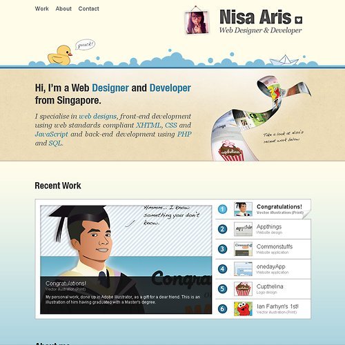
I’ve just been looking through Nisa Aris’ work and noticed at the bottom of her website, she has a link to her Tumblr site! Since the start of my Multimedia course at Nottingham Trent University, I’ve always been using Google’s Blogger but now, after spotting Tumblr (and liking it a lot!) I think I’m going to convert to Tumblr soon.

Looking through Nisa Aris’ sites I really like the way her designs (her portfolio and Tumblr page) compliment each other, which is done by keeping a constant theme through these sites. In light of this, I hope to re-design my website, blog and twitter page so that I can keep a uniformity in my style and a familiarity within my brand ‘City&Wool.’

Website Wireframe

0 comments

Here is a quick wireframe for my Speakers Corner web design project -

Main points for index page -

  • Clean & simple design (Similar to http://purplerockscissors.com/)
  • Good use of large photos/images (Within the events highlights)
  • Simple to navigate (Navigation at top right)
  • Use of Javascript elements within the site
  • Key information displayed on right hand side (Opening times, telephone, email)
  • Easy to contact/network with Speakers Corner (news/twitter feed)
Points to consider -
  • Band/DJ profiles (Links to their sites - good use of networking)
  • Speakers Corner to be considered as a brand? tag line?
  • Link their Twitter feed to the site to keep up to date with events
CSS
http://csszengarden.com/

Seminar 2 - Design Exercise 2, Research & Development Task

0 comments

Building - Structure - Environment

Ideas...
Ysgol Bod Alaw - My old primary school
Oriel Mostyn Gallery - A gallery in Llandudno, North Wales
Victoria Pier - The Pier in my town of Colwyn Bay
Mase Studios - Recording studio that I used to use with my band

Speakers Corner
'A bar on the corner of Penrhyn and Abergele roads in Colwyn Bay (just west of The Central pub), Speakers Corner offers a wide selection of smoothies, coffees, juices and alcoholic drinks, as well as cakes & hot ciabattas, art exhibitions and an eclectic mix of great bands of an evening.

It is the place to be for alternative thinkers and smoothie drinkers; as well as lovers of music, art and all things entertaining, enlightening and filmed.'

Source - http://www.bebo.com/Profile.jsp?MemberId=6985007077

Speakers Corner Facebook Group - http://www.facebook.com/Speakers.NorthWales

Interesting websites I've just spotted -
http://www.wireframe.co.za/
http://eng.designerbreak.com/2009/tutorial/wireframes-and-concept-planning-a-website/
http://hello.hotgloo.net/index.html
http://www.frieze.com/magazine/

3 Examples of Websites Updated by the Users

0 comments

Craigslist - http://nottingham.craigslist.co.uk/

Craigslist is a collection of local classified adds and forums which are community moderated, and largely free. You can find jobs, housing, goods, services, romance, local activities or advice.

It has a simple, 'no-frills' design and is reasonably easy to use however can be overwhelming at first.

Abduzeedo - http://abduzeedo.com/

'Abduzeedo is a collection of visual inspiration and useful tutorials
. There are all sorts of articles for those who want to look for inspiration. Also you will find very useful tutorials for the most used applications out there, with a special selection of Photoshop Tutorials and Illustrator Tutorials. One of the goals of Abduzeedo is to be an open channel to the design community, encouraging feedback. The Daily Inspiration is a proof of that, everybody can send images that inspired them so we can share with the community.'

I regularly use Abduzeedo to look for inspiration for my projects. I find its simple design makes it easy to navigate and I like their use of large images to pull you into reading each articles. I also enjoy the fact its always changing due to the ability for anyone to update it.

VectorArt -
http://www.vectorart.org/

VectorArt is a collection free vector illustration for file download. It allows users to upload their own vector files to the site an catalogs them in a clear and neat manner. I find using vectors can be very helpful in designing anything from websites to poster.

Good Morning Internet!

0 comments

This morning, after a good weekend, I turned on my laptop to catch up with the world of design! I regularly check various design blogs, for example -

..and while checking out the last link, the Abducted by Design site, I spotted an article 'Best of the Week #87' (http://abduzeedo.com/best-week-87) This is a round up of all design related stuff that's happened in the week.

While browsing, I spotted a few interesting articles...

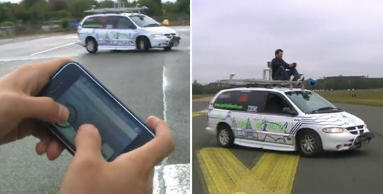
The first link is an article about a new iPhone application called 'iDriver.' This application allows you to drive a car with your iPhone! ...Yes its true! Check out this video of it in action -


http://www.designboom.com/weblog/cat/16/view/7891/idriver-iphone-remote-controlled-car.html

The second link that caught my attention was this one...

This is a truly unique web experience! Using your webcam and microphone, you navigate the site buy moving your hands to highlight different areas of the site. To move to different pages all you have to do is say 'home,' 'about' or 'music.' Its a brilliant example of interactive design because your interacting with the site in a different and some what enjoyable way. My only suggestion is to make sure no ones about when your shouting 'home!' at your laptop screen.. this could be viewed as slightly wired. Follow the link to try it out for yourself -

http://hundertmarkblog.de/because-clickin-is-so-90s-navigation-durch-mikro-und-webcam/

My final link is to a new Facebook UI designed by Australian designer Barton Smith. In redesigning the Facebook UI, with it’s 'streamlined, structured and linear interface' it's more 'comprehendible, enhancing the user experience and absorbability of content.'

Facebook Facelift - Home & Profiles from wearetol on Vimeo.

I really like this new design due to its simplicity and cleanliness but is it too neat and tidy? I can't help but think it looks too business-like. Maybe to solve this problem the use of more colour in the design would improve it? But the big question is the whole Facebook community, would they warm to it?

http://www.aguynamedvernonmac.com/2009/10/17/facebook-facelift-by-barton-smith/

Web Applications and Interaction Design

0 comments

Exercise
Read and comment on the following content in your online journal -

Dan Saffer: 'Interaction design is an applied art' August 13, 2008
http://www.designinterviews.com/interviews/interaction-design-is-an-applied-art

Joel Schafer: 'I'm into minimalistic clean design' January 15, 2008
http://www.designinterviews.com/interviews/599

My comments...

Dan Saffer Interview

Ive highlighted some points of interest in Dan's interview and will comment on each point -

Do you believe formal design education has more to offer than self-teaching?

'You need a (for lack of a better word) Master standing over you while you do your apprentice work.'

'All that being said, there is certainly value in learning things on your own ... You can read every book in the field and be a terrible designer. You have to practice it, live, preferably with a client and (eventually) with users.'

I agree with Dan's views on this question. It can be important to have a 'master' to teach you. Being taught by tutor or teacher helps you to develop your intake of information, helps you look at other points that you might not have seen and introduces you to new aspects that you might never known about before hand. Learning things on your own can also be useful. In my experience, being a self taught web designer, I like the controll that I have over how fast or slow I want to develop my skills, but can sometimes find it hard to have the drive to read up on things without being taught or shown it first.

Would you explain the difference between interface and user-centered design?

'Interface design is the physical expression of the interaction design: the skin over the muscles and bone. Interaction design says, 'We need a button to turn on the siren.' Interface design says, 'The button should be here and it should be red.' They are deeply intertwined, since you cannot have one without the other.'

Dan's explanation of Interaction Design and Interface Design has made it easier for me to note the differences between them both. Interface Design focuses more on aesthetics and apperance and Interaction Design focuses on what needs to happen/needs to be done.

What are the typical mistakes that interface design newbies encounter and how to avoid them?

'I'd say there are two mistakes that new designers make: one is not coming up with enough variations—or, more accurately, not being able to come up with more alternatives. Which is to say, falling in love with one direction and not being able to see others. Often, this is direction is something familiar, that the designer is comfortable with. It is hard to kill your babies, but sometimes you have to.

The second mistake is one of details and completeness. What separates a great designer from a good one is the ability to not only come up with great concepts but to also see those through down to small details. The details are hard; making sure every part of the products works well and works together into a pleasing whole is hard to do. Playing out what a concept means down to the details is an important skill to learn.'

Unfortunately for me, I have actually fallen into the first mistake on previous web design projects. Hopefully in actually acknowledging it in his interview it will help me to overcome this problem in future projects. Details are also important for me to work out in any and all designs. In working out details early on, it could ultimately save you time in your design process.

What is it you find most irritating and/or distracting while working?

'My own ignorance, lack of skills, or inability to grasp new concepts. My own limitations are always more frustrating than almost anything external. My work place is always cluttered, noisy, and chaotic. That doesn't bother me overmuch.'

In reading Dan's answer to this question, I find that I also feel the same about myself. My lack of skills and the inability to come up with new concepts has always played on my mind, but this only becomes a hinderance if you don't do anything about it. I personally, am always trying new things out to develop my skills and I'm now trying to look to different areas to find inspiration. An example of what Dan Saffer likes looking at is mechanical interfaces. I have also been recently inspired by 'Letterpool' to maybe create a collection of my own.. who knows maybe 'Letterham' (for Nottingham) will soon be popping up!

Joel Schafer's Interview

In 4 years Joel Schafer, from buying a html book in 1997, graduated as web & media producer in 2001 - A quick process! He states how important it is to always write down everything on paper before starting a project, which is something that I don't always follow. I prefer going straight on to computer to start creating ideas because I find my drawing skills can restrict my desgins - Maybe this can be an area to improve and develop? In reading about how he gets his images for his web designs he says its always good to know a good photographer! (A nice reference to networking as a designer) Joel says how web is going to develop it interactivity with 3d and movie clips. In reading this I wondered if I could design a 3D website. This would be a brilliant project to work on! So I started researching an found a flash webstie in 3D (http://www.lech.pl/) Trouble is I need to get myself some retro 3D glasses first! Wish me luck in finding some!

What have I been up to?

0 comments

Over the past few weeks I've been increasing my web portfolio...

Firstly, I've completed a redesign of the Nottingham Trent Christian Union website ready for the new year at Trent...


Secondly, I've been (and still am) working on a redesign for GeoVista, a company that provides the best in intelligent borehole logging systems world wide...

Video Screens Hit Paper Magazines

1 comments

A news article by BBC about video screens used in magazines!


Here's a small Youtube demonstration of the small video screen working...

Julian Mullineux | Fine Art Photography

0 comments

A website for a fine art photographer studying at Nottingham Trent called Julian Mullineux, now complete. A flash version of this website will soon be developed and uploaded too.

A New Style For The Kitty&Wool

0 comments

A new style for the Kitty&Wool blog has been applied. This notebook/scrapbook style has been designed by RayCreations.net. For more free blogspot themes have a look at the link below -

http://www.raycreationsindia.com/free-blogspot-templates.aspx

OK... So it's been a while

1 comments

After various emails and phone calls, UKTyres' website will be soon be introduced to the World Wide Web! However, I must admit, it's taken longer to design then I expected due to weak guidelines being set at the start. (Client unsure of what look/style they liked for the site) But it's been a good learning experience and I now know how to improve my design process to stop problems cropping up with other projects.


Other projects include iHOC logo (for the Welsh Hocky Union)


I've also been asked to create a prototype site for a project called iHero. I will be designing this site over the next few weeks.

Summer Projects

1 comments


So the holidays are in full swing and my design portfolio is increasing due to some new web designs added to the collection. I've recently finished a website for a local artist called Terry Mart - http://www.terrymart.co.uk and I'm soon to be designing a website for another photographer studying at Nottingham Trent callded Julian Mullineux. Below is a prototype images of how his site will look.

The FWA Site of the Month for June

0 comments

After flicking through a few sites for new inspiration, I found myself checking out the Favourite Website Awards site (www.thefwa.com) In doing so, I came across this site as site of the month for June - 'BooneOakley.com'

Go on, check it out now!
BooneOakley.com

So, hopefully you've just been checking out their site and relised that the website is completely done through videos on YouTube! A brilliant Idea which makes me want to create a site of my own through using YouTube alone.

Summer Projects Updates

0 comments

A web design for 'nrevival.' I've only designed a splash page and a home page with all the information that needs to be included in the site. Over the next few days I will split all the information on the home page into individual smaller pages. Take a look at it by clicking on the image -


Update on the UKTyres site, I've created a draft home page design for the client to view and give his opinion on it -

Motion Typography

0 comments

Motion Typography is amazing! Here are a few examples of a few motion typography videos I've found on Vimeo -

Braveheart in Kinetic Typography from Barraco Pleto on Vimeo.


Bound4LIFE Promo from organic visual on Vimeo.

Its been a while...

0 comments

Well my first year at NTU has finished and the summer holiday are in full swing. Here is a quick overview of what I'm going to be working on over the next few months -

  • Terry Mart Website Redesign
  • PDBC Website Redesign/Update
  • UKTyres Web Design
  • Autostreet Online Gallery
  • iHoc (Indoor Hockey) Welsh Hockey Union Logo
Phew! A lot of work so must get going!

Just a quick note to all Virtual Environment students next year...

This website is well worth checking out -


And to finish off some nice looking infographics thanks to Abduzeedo...


More Inforgraphics can also be found at Good too...